



Eddyter documentation
A powerful, configurable rich text editor built on Lexical with AI capabilities and API key authentication.
Last updated:
Compatibility
Eddyter requires React 18.2+ or 19, so it works with any Next.js version on that React — Next.js 13 and newer — in both the App Router and Pages Router. Render Eddyter in a Client Component ('use client'), or load it via next/dynamic with ssr: false.
Getting Started
Integrate Eddyter into your Next.js app (App Router or Pages Router) in 10 minutes.
Framework Support
Installation
Install the package via your preferred manager:
npm install eddyterOr with yarn / pnpm:
yarn add eddyter
# or
pnpm add eddyterStyle Integration
Import the required CSS so toolbars, tables, menus, and editor chrome render correctly:
import 'eddyter/style.css';Production note
app/layout.tsx (App Router) or pages/_app.tsx (Pages Router) so it loads on every route.Get your API key
Sign up and get your API key from the dashboard:
- Create an account at eddyter.com
- Navigate to License Keys in your dashboard
- Copy your API key
Free Trial
Add Eddyter to your app
Implement Eddyter with your API key:
'use client';

import React from 'react';
import {
  ConfigurableEditorWithAuth,
  EditorProvider,
  defaultEditorConfig
} from 'eddyter';

// The editor relies on browser APIs, so it must run as a Client Component.
// Keep the 'use client' directive above, or load it via next/dynamic with
// { ssr: false } from a Server Component.
export default function Editor() {
  const apiKey = process.env.NEXT_PUBLIC_EDITOR_API_KEY!;

  // Current logged-in user for comments feature
  const currentUser = {
    id: 'user-123',
    name: 'John Doe',
    email: 'john@example.com',
    avatar: 'https://example.com/avatar.jpg' // optional
  };

  const handleContentChange = (html: string) => {
    console.log('Editor content:', html);
    // Save to state, database, etc.
  };

  return (
    <EditorProvider
      defaultFontFamilies={defaultEditorConfig.defaultFontFamilies}
      currentUser={currentUser}
    >
      <ConfigurableEditorWithAuth
        apiKey={apiKey}
        onChange={handleContentChange}
        initialContent="<p>Start writing...</p>"
        mentionUserList={['Alice', 'Bob', 'Charlie']}
        onAuthSuccess={() => console.log('Editor ready!')}
        onAuthError={(error) => console.error('Auth failed:', error)}
      />
    </EditorProvider>
  );
}
Environment Variable
Video on Integrating with AI
Authentication
Standard API key verification to enable premium features and AI capabilities.
How it works
- Pass your API key to the
apiKeyprop on<ConfigurableEditorWithAuth>. - Eddyter validates the key against our server
- Features are enabled based on your subscription plan
onAuthSuccessfires when validation succeedsonAuthErrorfires if validation fails
Custom verification (optional)
You can provide your own verification function if you need to validate keys through your backend:
<ConfigurableEditorWithAuth
  apiKey={apiKey}
  customVerifyKey={async (key) => {
    // Proxy through a Next.js Route Handler (app/api/verify-editor-key/route.ts)
    const response = await fetch('/api/verify-editor-key', {
      method: 'POST',
      body: JSON.stringify({ key })
    });
    const data = await response.json();
    return {
      success: data.valid,
      message: data.message
    };
  }}
/>
Features
A comprehensive toolset for modern content creation, from basic formatting to advanced AI generation.
Classic Formatting
Basic Formatting
Bold, italic, underline, strikethrough, subscript, superscript
Text Colors
Text color and background highlight with color picker
Font Controls
20+ font families with adjustable font sizes and line height
Text Alignment
Left, center, right, and justify alignment
Lists and Structure
Bulleted Lists
Custom bullet styles with proper nesting
Numbered Lists
Decimal, alpha, and roman numeral formats
Checklists
Interactive checkboxes with strikethrough
Headings
H1-H6 heading levels
Tables
Table Operations
Insert/delete rows and columns, merge cells
Cell Resizing
Drag to resize columns and rows
Header Styling
Distinct header row styling
Context Menu
Right-click menu for quick actions
Media Support
Images
Drag-drop upload with 8-point resize handles
Videos
YouTube/Vimeo embed with responsive players
File Attachments
Upload and attach downloadable files
Link Management
Insert links with floating editor and preview
AI PowerPremium
Smart Chat
In-editor AI assistant for research, drafting, and creative ideas.
Smart Autocomplete
Predictive text suggestions as you type.
Refinement
Instantly improve tone, fix grammar, or change content length.
Gen-AI Images
Create custom visuals from text prompts inside your document.
Version HistoryPlan-gated
Server-backed versions
Snapshots are stored on Eddyter, scoped by a documentId — no autosave, no local storage. Versions are created from the panel's Save button or your own saveVersion() call.
Preview & restore
A toolbar toggle opens a side panel to preview any past version and restore it. Restore appends a new version — nothing is ever destroyed.
Correct documentId + saveVersion()
Pass a per-document documentId (its own URL for the fallback, or a real id in single-page apps). Call editorRef.current.saveVersion({ documentId }) from your Save button — required for new records; the panel's own Save button covers existing ones.
Smart & safe
Unchanged saves are deduped. Call saveVersion() while the editor is still mounted — it no-ops after unmount.
Email TemplatesPlan-gated
Drag-and-drop builder
The envelope button in the toolbar switches to an email builder — a block palette, a 600px canvas, and a styles panel. Sections, 1–3 column rows, images, buttons, dividers, spacers and social icons.
Six starter templates
A gallery opens on the first switch: newsletter, product launch, welcome, promotion, event invite and a plain note. Every block stays editable, and Start from blank clears the canvas instead. Templates ship no stock photos and no placeholder links.
Email-safe HTML
Output is nested tables with inline styles, align/bgcolor attributes and absolute image URLs — what Outlook and Gmail need, which normal rich-text HTML is not.
Delivered through onChange
The same onChange you already use. Its second argument, meta.mode, is "email" when the builder produced the HTML, so you can store the two surfaces separately.
Merge tags
You declare the field list with emailMergeTags — mapped from your ESP, CRM or database — and your users drop them in as pills by typing "{{". The prefix is configurable, so *| gives Mailchimp syntax. Tags work in button and link URLs, which is how an unsubscribe link gets in, and Preview fills them with sample values.
For sending, not re-editing
You get the email body — a full-width page table around a centred 600px card — so add only a doctype and <head>, never a second centring table. It is not loaded back into the document editor, and the canvas is not persisted across reloads.
Configuration
Tailor every aspect of Eddyter to fit your application's specific needs.
Toolbar Configuration
Configure toolbar behavior with the toolbar option. In sticky mode you can set offset and zIndex. In static mode those values are ignored.
<ConfigurableEditorWithAuth
  apiKey="your-api-key"
  toolbar={{ mode: "sticky", offset: 64, zIndex: 1200 }}
/>
Defaults: { mode: "sticky", offset: 20, zIndex: 1000 }.
In static mode, the editor automatically defaults to a maxHeight of 600px. You only need to pass the editor option if you wish to override this default.
<ConfigurableEditorWithAuth
  apiKey="your-api-key"
  toolbar={{ mode: "static" }}
  // editor={{ maxHeight: 400 }} // Optional: overrides 600px default
/>
Keyboard Shortcuts
Speed up your workflow with standard keyboard shortcuts.
Text Formatting
Ctrl/Cmd + BCtrl/Cmd + ICtrl/Cmd + UCtrl/Cmd + Shift + XCtrl/Cmd + ECtrl/Cmd + ,Ctrl/Cmd + .Ctrl/Cmd + \Headings & Structure
Shift + Alt + 1…6Shift + Alt + 0Shift + Alt + QShift + Alt + CLists & Indent
Ctrl/Cmd + Shift + 8Ctrl/Cmd + Shift + 7Ctrl/Cmd + Shift + 9Ctrl/Cmd + ]Ctrl/Cmd + [Alignment
Ctrl/Cmd + Shift + LCtrl/Cmd + Shift + ECtrl/Cmd + Shift + RCtrl/Cmd + Shift + JInsert
Ctrl/Cmd + KCtrl/Cmd + Shift + -Shift + Alt + TCtrl/Cmd + Alt + IGeneral
Ctrl/Cmd + ZCtrl/Cmd + YCtrl/Cmd + ACtrl/Cmd + Shift + .Ctrl/Cmd + Shift + ,Slash Commands
/ at the start of a line to access the quick formatting menu.API Reference
<EditorProvider>
Provides context and configuration for the editor. Must wrap the editor component to enable all features.
| Prop | Type | Description |
|---|---|---|
| children | ReactNode | The wrapped content. |
| defaultFontFamilies | string[] | Override default font list. |
| currentUser | CurrentUser | User info for comments. |
| apiKey | string | API key for read-only mode. |
<ConfigurableEditorWithAuth>
The core editor component with built-in subscription verification and AI service integration.
| Prop | Type | Req | Description |
|---|---|---|---|
| apiKey | string | Yes | Your Eddyter license key. Authenticates the editor against the server and unlocks tier-based features. |
| initialContent | string | No | Initial HTML loaded into the editor on first render. |
| onChange | (html: string) => void | No | Called ~300 ms after content changes (debounced). Receives the current HTML. |
| onAuthSuccess | () => void | No | Fires once the API key is verified and the editor is ready. |
| onAuthError | (error: string) => void | No | Fires when API key verification fails. Receives the error message. |
| customVerifyKey | (apiKey: string) => Promise<ApiResponse> | No | Provide your own verifier (e.g. proxy through your backend) instead of the default endpoint. |
| mode | "edit" | "preview" | No | Render the full editor ("edit", default) or a read-only preview with link previews ("preview"). |
| containerClassName | string | No | Class applied to the outer wrapper container. |
| contentClassName | string | No | Class applied specifically to the editor's writable content area. |
| onPreviewClick | () => void | No | Fires when the user clicks inside preview mode — typically used to switch to edit mode. |
| darkMode | boolean | undefined | No | true forces dark, false forces light, undefined (default) auto-detects from the host app's <html>/<body> dark class. |
| toolbar | { mode?: "sticky" | "static"; offset?: number; zIndex?: number } | No | Toolbar behaviour config. Defaults to { mode: "sticky", offset: 20, zIndex: 1000 }. |
| editor | { maxHeight?: string | number } | No | Container options. maxHeight only applies when toolbar.mode = "static" — caps the editable area's height. |
| defaultFontFamilies | string[] | No | Override the font picker list. Defaults to the 24 fonts in defaultEditorConfig.defaultFontFamilies. |
| uiFontFamily | string | No | Font for the editor's UI chrome — toolbar labels, menus, dialogs, sidebars — so it matches your app's typography. Does NOT change document content (that's the font picker). Google Fonts families are fetched automatically; a font your page already loads is used as-is. Defaults to Geist. |
| contentFontFamily | string | No | Starting font for the DOCUMENT TEXT, shown as selected in the font picker. A default, not a lock — the user can pick another font and their choice wins. Applies to newly typed text; existing content without its own font stays on DM Sans. Not to be confused with defaultFontFamilies, which is the list of fonts offered. |
| mentionUserList | string[] | No | Usernames available to the @mentions autocomplete. |
| className | string | No | Class on the outer wrapper element. |
| uiStyle | "default" | "compact" | No | Visual style of the editor. Omit it for the default style. Set "compact" to render the toolbar and content as one framed card; layout and behavior are unchanged. |
| documentId | string | No | Stable id that scopes version history to this document — pass your record's primary key and reuse it on reopen so history reconnects. If omitted, a best-effort id is derived from the URL (warns; breaks if the URL changes). |
| ref | React.Ref<EddyterEditorHandle> | No | Imperative handle for version history. Call ref.current.saveVersion({ label?, documentId? }) from your Save button to snapshot a version (server-backed, plan-gated). Call it while the editor is still mounted — it no-ops after unmount. |
Code Examples
Basic Eddyter
import { ConfigurableEditorWithAuth, EditorProvider } from 'eddyter';
import 'eddyter/style.css';

export default function BasicEditor() {
  return (
    <EditorProvider>
      <ConfigurableEditorWithAuth
        apiKey="your-api-key"
        onAuthSuccess={() => console.log('Ready!')}
      />
    </EditorProvider>
  );
}
State Management
import { useState } from 'react';
import { ConfigurableEditorWithAuth, EditorProvider } from 'eddyter';
import 'eddyter/style.css';

export default function EditorWithState() {
  const [content, setContent] = useState('<p>Start writing...</p>');

  return (
    <EditorProvider>
      <ConfigurableEditorWithAuth
        apiKey="your-api-key"
        initialContent={content}
        onChange={setContent}
      />
    </EditorProvider>
  );
}
Version History
Pass a correct per-document documentId (its own URL enables the fallback; in single-page apps where documents share a URL you must pass a real record id, or their histories collide). The toolbar toggle opens a panel to save, preview, and restore (server-backed, plan-gated). The panel's own Save button covers existing records; call saveVersion({ documentId }) from your Save button for new records and to snapshot from your own UI (call it while the editor is still mounted).
import { useRef, useState } from 'react';
import {
  ConfigurableEditorWithAuth,
  EditorProvider,
  type EddyterEditorHandle,
} from 'eddyter';
import 'eddyter/style.css';

export default function NoteEditor({ note }) {
  const editorRef = useRef<EddyterEditorHandle>(null);
  const [content, setContent] = useState(note?.content ?? '');

  const handleSave = async () => {
    // 1) Persist content to YOUR backend first — returns the saved record { id }.
    const saved = await saveToYourBackend({ id: note?.id, content });

    // 2) Snapshot a version BEFORE unmounting the editor. saveVersion() reads
    //    the live editor state and no-ops once the editor unmounts.
    try {
      await editorRef.current?.saveVersion({ documentId: saved.id });
    } catch (err) {
      console.error('Version save failed:', err); // non-fatal
    }
  };

  return (
    <>
      <button onClick={handleSave}>Save</button>
      <EditorProvider>
        <ConfigurableEditorWithAuth
          // Remount when switching documents so initialContent reloads cleanly.
          key={note?.id ?? 'new-note'}
          ref={editorRef}
          apiKey="your-api-key"
          documentId={note?.id}
          initialContent={content}
          onChange={setContent}
        />
      </EditorProvider>
    </>
  );
}
Email Templates
There is no separate email component and no extra prop. The envelope button switches the editor to the email builder, and its output arrives through the onChange you already have — the second argument, meta.mode, says which surface produced the HTML. Keep the two apart: onChange reports whichever surface is active, so a single field would be overwritten by the next edit in the other one.
import { useState } from 'react';
import { ConfigurableEditorWithAuth, EditorProvider } from 'eddyter';
import 'eddyter/style.css';

export default function EmailComposer() {
  const [documentHtml, setDocumentHtml] = useState('');
  const [emailHtml, setEmailHtml] = useState('');

  return (
    <EditorProvider>
      <ConfigurableEditorWithAuth
        apiKey="your-api-key"
        onChange={(html, meta) => {
          // meta.mode is "email" while the email builder is open.
          if (meta?.mode === 'email') setEmailHtml(html);
          else setDocumentHtml(html);
        }}
      />

      <button onClick={() => sendCampaign(emailHtml)}>Send</button>
    </EditorProvider>
  );
}
Eddyter ships no field list, and no field names are built in. Every field name in the examples below — first_name, company, unsubscribe_url — is one we invented to have something to show. None is reserved, none is recognised, and none carries any meaning to the editor. Call yours FNAME, Contact.GivenName or Bestellnummer; the editor renders whatever you hand it and exports it unchanged.
That is precisely why emailMergeTags exists. The editor cannot know which fields your email platform supports or what your database calls them, so you declare them — from your ESP's merge fields, your CRM, or your own columns. Pass nothing and the whole feature stays hidden, because there is no sensible default to fall back on. Your users then pick from that list; there is no UI for them to invent a field, since a name your platform has never heard of would ship as literal text to a real inbox.
Each value is the inner name without the braces — the editor adds them. The prefix is both the syntax and the key users type to open the field menu, so one pair of props retargets the whole feature at a different platform.
// The field list is data, not configuration — so it usually comes from
// wherever you already keep it, and can differ per account.
export async function getMergeFields(accountId: string) {
  const columns = await db
    .select()
    .from(contactFields)
    .where(eq(contactFields.accountId, accountId));

  return [
    ...columns.map((c) => ({
      // REQUIRED. The name YOU use — inner name only, no braces.
      value: c.key,
      // Optional. The picker's label; falls back to the value above.
      name: c.label,
      // Optional. A heading in the picker.
      group: c.category,
    })),
    // Nothing stops you hard-coding entries alongside the fetched ones.
    // "sample" is optional and feeds Preview only — it never reaches a
    // real email, so there is no need for a column to hold it.
    { value: 'order_total', name: 'Order total', sample: '$48.00', group: 'Order' },
    // The link every marketing email needs. Usable as a whole button href.
    { value: 'unsubscribe_url', name: 'Unsubscribe URL', group: 'System' },
  ];
}
Only value is required. There is a fourth, optional sample — a stand-in value used by the Preview button and nowhere else. It never reaches a real email and it is not a stored default, so you do not need a column for it; hard-code one if you want Preview to read as a finished email rather than showing [First name], and omit it otherwise.
Pass the result straight in. A fetched array is a new reference on every render, which normally forces you to memoise — here it does not, because the config is rebuilt from the array's contents, not its identity. While the request is in flight the list is empty, and an empty list hides every merge-tag control by design — so the menu appearing a moment late is expected, not a bug.
import { useEffect, useState } from 'react';
import { ConfigurableEditorWithAuth, substituteMergeTags } from 'eddyter';
import type { EmailMergeTag } from 'eddyter';

function PersonalizedEmail({ accountId }: { accountId: string }) {
  const [mergeTags, setMergeTags] = useState<EmailMergeTag[]>([]);
  const [emailHtml, setEmailHtml] = useState('');

  useEffect(() => {
    fetch(`/api/accounts/${accountId}/merge-fields`)
      .then((r) => r.json())
      .then(setMergeTags);
  }, [accountId]);

  // What onChange gives you keeps the raw placeholders — your email
  // platform substitutes them at send time:
  //   <p>Hi <strong>{{first_name}}</strong>, your order has shipped.</p>
  //
  // ...and if you want a filled-in preview yourself:
  const preview = substituteMergeTags(emailHtml, {
    first_name: 'Alex',
    company: 'Acme',
  });

  return (
    <>
      <ConfigurableEditorWithAuth
        apiKey="your-api-key"
        emailMergeTags={mergeTags}
        // Mailchimp syntax instead? These two lines are the whole change:
        // emailMergeTagPrefix="*|"
        // emailMergeTagSuffix="|*"
        onChange={(html, meta) => {
          if (meta?.mode === 'email') setEmailHtml(html);
        }}
      />
      <iframe srcDoc={preview} title="Preview" />
    </>
  );
}
What you get back is the email body: a full-width page table carrying the page background, wrapping a centred 600px card. The centring is already done, so add only a doctype and a <head> before handing it to your sending platform — wrapping it in a second centring table is what leaves a 600px email with half-width coloured bands.
Send it with the placeholders still in it. The recipients come from your database and the values go alongside, one map per person, so the platform merges at delivery — one request per 1000 recipients rather than one per recipient, which is the only shape that survives a real list. Nothing here needs substituteMergeTags: the default {{ }} is already Handlebars, which is what SendGrid expects.
import sgMail from '@sendgrid/mail';

sgMail.setApiKey(process.env.SENDGRID_API_KEY!);

export async function sendCampaign(
  emailHtml: string,
  subject: string,
  accountId: string,
  recipientIds: string[],
) {
  // Never trust the client for addresses. It sends IDs; you resolve them,
  // scoped to the caller's account, and you re-check consent here.
  const recipients = await db
    .select()
    .from(contacts)
    .where(and(
      eq(contacts.accountId, accountId),
      inArray(contacts.id, recipientIds),
      eq(contacts.unsubscribed, false),
    ));

  const html = `<!DOCTYPE html>
<html lang="en">
<head>
  <meta charset="utf-8">
  <meta name="viewport" content="width=device-width, initial-scale=1">
  <meta name="x-apple-disable-message-reformatting">
  <title>${subject}</title>
  <!--[if mso]>
  <noscript><xml><o:OfficeDocumentSettings>
    <o:PixelsPerInch>96</o:PixelsPerInch>
  </o:OfficeDocumentSettings></xml></noscript>
  <![endif]-->
</head>
<body style="margin:0;padding:0;">${emailHtml}</body>
</html>`;

  const BATCH = 1000; // SendGrid's cap on personalizations per request

  for (let i = 0; i < recipients.length; i += BATCH) {
    await sgMail.send({
      from: 'you@yourdomain.com',
      subject,
      html,
      isMultiple: true,
      personalizations: recipients.slice(i, i + BATCH).map((r) => ({
        to: [{ email: r.email }],
        // Keyed by the tag's INNER value — the same names you declared in
        // getMergeFields, with no braces.
        dynamicTemplateData: {
          first_name: r.firstName,
          company: r.company,
          // Per recipient, always. One shared unsubscribe link means the
          // first person to click it unsubscribes your entire list.
          unsubscribe_url: `https://app.example.com/u/${r.unsubscribeToken}`,
        },
      })),
    });
  }
}
Merging yourself with substituteMergeTags is the right call for transactional mail, test sends, and values your platform does not hold — but it costs one API call per recipient, so check for leftover placeholders before sending. A key missing from your value map is not an error: unknown placeholders are left untouched on purpose, which is what keeps platform syntax like {{ total | money }} working. The cost is that a typo ships a literal {{frist_name}} to a real person.
Layout Recipes
Eddyter Fit to Page
Create a Notion-style, edge-to-edge layout by passing the fitToPage={true} prop. Eddyter fills the full height of its parent: the toolbar stays at the top, the writing area takes the rest of the space and scrolls inside itself, and the word count sits at the bottom. The whole area is clickable, not just the lines that have text.
<ConfigurableEditorWithAuth
  apiKey="your-api-key"
  fitToPage={true}
/>
Having issues with Fit to Page?
Fit to Page fills the height of the element that wraps Eddyter, so that element needs a height. Check these before you add the prop:
- The parent has a real height — a fixed height,
h-full,h-dvh,flex-1inside a flex column, or a grid cell whose row has a height. - The parent is a flex column (
flex flex-col). This works whether the height comes from a fixed value or from a flex/grid layout. - Add
min-h-0when the parent is itself aflex-1child. Without it, long content makes the page taller instead of scrolling inside Eddyter. - Don't add
overflow-auto/overflow-y-autoto the parent. Eddyter scrolls inside itself; a scrolling parent adds a second scrollbar. - Use a height, not just
min-height. With only a minimum height, Eddyter fills at least that space but keeps growing with long content instead of scrolling inside itself. For fill-and-scroll, give the parent a height (h-[600px],h-dvh,flex-1 min-h-0…).
<div className="flex flex-col h-dvh">
  <header className="shrink-0">…</header>

  {/* The editor's parent: flex column + height + min-h-0 */}
  <main className="flex flex-col flex-1 min-h-0">
    <ConfigurableEditorWithAuth
      apiKey="your-api-key"
      fitToPage={true}
    />
  </main>
</div>| Layout | Parent classes |
|---|---|
| Fixed-height box | flex flex-col h-[600px] |
| Full screen | flex flex-col h-dvh |
| Below a header, inside a flex column | flex flex-col flex-1 min-h-0 |
| Grid cell | flex flex-col min-h-0 (the grid row needs a height) |
| Side panel / Sheet | flex flex-col h-full |
If the parent has no height, nothing breaks: Eddyter simply grows with its content and the page scrolls instead of the editor. To check, inspect the parent in DevTools — if its height is auto or matches the editor's content, give it a height using one of the layouts above.
Using Fit to Page in a modal
To make Eddyter fill the full height of a modal, make the modal a flex column with a fixed height (for example flex flex-col h-[95vh]) and wrap Eddyter in a container that takes the remaining space (flex flex-col flex-1 min-h-0). Eddyter scrolls inside itself, so the wrapper doesn't need overflow-y-auto.
<div className="flex flex-col flex-1 min-h-0 relative border border-main-border/10 dark:border-main-border/[0.07] rounded-xl mb-9">
  <ConfigurableEditorWithAuth
    apiKey="your-api-key"
    fitToPage={true}
  />
</div>
Other content in the modal: titles, fields or buttons can sit above or below Eddyter in the same flex column. Give them shrink-0 so they keep their size, and Eddyter's wrapper (flex-1 min-h-0) takes the space that's left.
Eddyter UI Style
Pass uiStyle="compact" to render Eddyter as a single framed card — ideal for modals, forms and cards where Eddyter sits inside other UI. It only changes how the editor looks: the toolbar, height and word count keep their normal behavior, and your content is never touched.
"compact"A single framed card: toolbar and content share one rounded border and background, with the toolbar separated by a thin divider. For a stable box, also pass toolbar={{ mode: "static" }}.
"default"The standard editor: the toolbar sits in its own rounded box above the content area. This is applied automatically — you don't need to pass uiStyle for it.
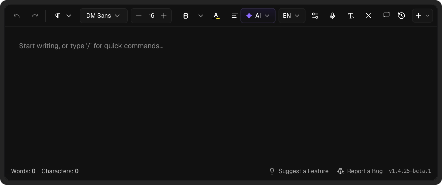
<ConfigurableEditorWithAuth
  apiKey="your-api-key"
  uiStyle="compact"
  toolbar={{ mode: "static" }}
/>
Note
uiStyle="default" — leaving the prop out gives the default style. Pass uiStyle="compact" only when you want the compact look.Theming
FORCE THEME
By default, Eddyter automatically detects the host application's theme. If you want to force a specific theme (regardless of the user's system or application settings), you can use the darkMode prop:
Force Dark Mode
<ConfigurableEditorWithAuth
  apiKey="your-api-key"
  darkMode={true}
/>
Force Light Mode
<ConfigurableEditorWithAuth
  apiKey="your-api-key"
  darkMode={false}
/>
UI FONT
Eddyter's interface uses Geist by default. Pass uiFontFamily to match your own product's typography — it restyles the toolbar labels, menus, dialogs and sidebars, so Eddyter stops looking like a foreign widget on your page.
<ConfigurableEditorWithAuth
  apiKey="your-api-key"
  uiFontFamily="Poppins"
/>
This affects the interface only — document content is untouched, since that font is chosen by your users in Eddyter's own font picker.
You don't need to load the font yourself. System fonts are used directly, any Google Fonts family is fetched automatically, and a font your page already declares with @font-face is detected and reused. Pass a single family name rather than a CSS stack — "Poppins", not "Poppins, sans-serif". An unrecognised name is ignored and the editor stays on Geist.
CONTENT FONT
uiFontFamily styles the interface. To set the starting font for the document text your users write, use contentFontFamily:
<ConfigurableEditorWithAuth
  apiKey="your-api-key"
  uiFontFamily="Poppins"     // toolbar, menus, dialogs
  contentFontFamily="Lora"   // the text users write
/>
The font appears as the selected value in the toolbar's font picker and is applied as your users type. It is a default, not a lock — anyone can pick a different font from the picker and their choice wins. If a user has pinned their own default font, that pin takes precedence over this prop.
It applies to newly typed text. Content you load through initialContent that carries no font of its own keeps rendering in Eddyter's base font, DM Sans — so an existing document can show both fonts until its text is rewritten. Loading works the same way as uiFontFamily, and this prop is separate from defaultFontFamilies, which controls which fonts the picker offers.
Support & Resources
License
Eddyter is licensed under the MIT License. Security, privacy, and compliance are our core technical principles.
Build Better Together
Our documentation is constantly evolving. If you can't find what you're looking for, feel free to reach out.